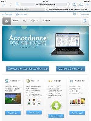
It’s no secret that we are right in the middle of the mobile revolution. In January 2014, mobile devices accounted for 55% of internet usage in the United States, officially surpassing desktop internet usage. That was four months ago, and the numbers have undoubtedly risen. As a business, we knew that if our users were on smartphones and tablets, that’s where we needed to be, too. We quickly realized that a vital step to catering to this new trend was optimizing our website for mobile devices.
Mobile optimization is a catch-all term that simply refers to the editing of a website to suit the mobile user’s experience. Every business has different goals when it considers optimizing its website for mobile devices. Here were three of ours:
Scalability
Have you ever visited a website and had to “pinch-to-zoom” your screen just to read what seemed like microscopic font? Have you ever gotten so frustrated with this pursuit that you’ve given up altogether? That’s the opposite of mobile optimization (one might even say it’s mobile-phobic) and it’s the very thing we wanted to get away from.
Finger-friendliness
Another crucial difference between desktop and mobile browsing is that users aren’t going to be navigating our website with the traditional means of a keyboard and mouse. Flicking, tapping, scrolling, and swiping have officially trumped typing in the mobile revolution. For this reason, banners, links, and menu items needed to be sized appropriately for tapping. Tiny buttons would only frustrate our fast-fingered users.
Functionality
We wanted to keep the user experience as close to that of the desktop site as possible, but when you start downsizing, things inevitably get crowded. Not every element on our homepage would fit on a 4-inch screen. We quickly realized that we needed to make some cuts. We considered scrapping the Tour page of our mobile site, but the optimized functionality was so slick, we ultimately decided to adapt it. Today, users can still access the content on this page through any device.
Learning as we go
We decided against creating a separate mobile site (which was the only solution for years) because it has many disadvantages. Instead we used a responsive technology that reorganizes the pages and swaps the content based on the screen width, or the window width on a computer. You can try it out by varying the window size in your browser.
We tried removing the site search functionality on mobile, which meant that users could no longer quickly jump to a specific product page or blog post. We quickly realized our mistake and restored a mobile-friendly site search tool. We were learning to roll with the punches.
All things considered, we’re quite pleased with the mobile site we’re currently operating with, yet eager to embrace any new technologies coming down the pike.
If you’re reading this blog post on an iPad, iPhone or Android device, you’re a perfect case study. The reason you don’t need to squint or pinch to read this text is because of this optimization initiative. Thankfully, we saw the wave of the mobile revolution rapidly approaching and rather than get swept away in the changing tides — we resolved to ride it.


