In January of this year, I heard a conference speaker make an oft-repeated observation about the book of Ephesians: namely, that it is clearly divided into two parts. The speaker asserted that in the first three chapters, Paul uses verbs in the indicative mood—that is, verbs that make a statement or convey information. In the last three chapters, Paul switches to imperative verbs. Thus, he moves from theology to application, from instruction to exhortation. This inspired me to blog about how you could use Accordance’s Analytics tools to see if Ephesians really is that divided.
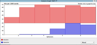
In that post, I searched the tagged Greek New Testament for all indicative or imperative verbs in the book of Ephesians and then graphed the results using an Analysis Graph. The initial graph looked like this:
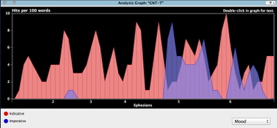
I then showed how you could customize the appearance of the Analysis Graph by opening the Set Analysis Graph Display dialog. Through that dialog, we reduced the number of words per hit to achieve a more detailed graph, chose an area graph rather than a bar graph, chose to overlay the two graphs rather than stacking them, and changed the background from white to black. The modified graph looked like this:
Now, the reason I’m bringing all this up again is that I want to show you how much more accessible Accordance 10 makes these various display options.
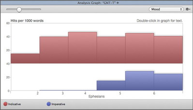
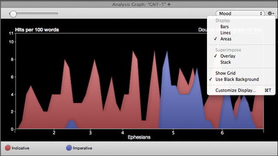
First, there is now a new slider that lets you adjust the number of words per hit and see the changes on the fly. While hits per 1000 words is a good sample size for a large search range like the entire New Testament, it is far too large a sample size for a small book like Ephesians. That is why the initial graph looks so blocky and imprecise. To see more detail, simply drag the slider to the left until you’re happy with the look of the graph. Here is what it looks like with the slider set to 100 words per hit.
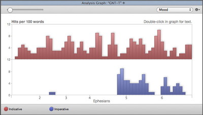
The new Gear menu likewise lets you set the most-used display options right from within the Graph itself, rather than having to go through a dialog box. Simply select the options you want until you achieve the desired look. Here is the resulting graph when we change from Bars to Areas, Stack to Overlay, and white background to black.
As you can see, the sample size slider and the Gear menu now make all the cool graph display options far more accessible and discoverable.
Oh, and the graphs look better too!


