Yesterday I argued that Accordance goes beyond mere electronic delivery of print books. Instead, we leverage the flexibility and power of the computer to give you new ways to interact with your books. One way we do that is by giving you unparalleled control over the appearance of the text.
Most e-Book readers give you some control over the appearance of text. Apple boasts about iBooks’ flexibility in that regard by saying that you can change the text size or “even change the font.” That’s great, and more than enough flexibility if your goal is primarily to duplicate the experience of reading a print book. Our goal is to enable you to interact with the text of a book in whatever way best suits your study, so merely changing the font or size is not nearly good enough.
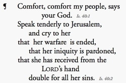
Consider all the different way you may want to interact with the text of the Bible. There may be times you want to read through the text without the distraction and disruption of verse references and superscripted footnote markers. Accordance lets you hide those elements.
Maybe you don’t want to remove the Scripture references altogether, but you want to make them as inconspicuous as possible. Accordance lets you place them before, after, or above the verse, format them however you like, and even choose to omit the book name and chapter number.
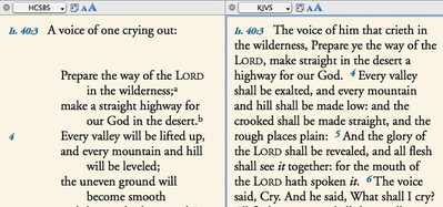
There may be times when you want to compare two different translations of a passage. The more modern translation formats the text as poetry, while the older one makes no visual distinction from prose.
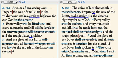
The difference in formatting makes it harder to track the differences between the two translations, but Accordance lets you suppress the poetic formatting of the one so you can better compare the two. Accordance also lets you choose to highlight the differences automatically.
When doing in depth study, you may like to mark up the text with all kinds of highlight colors and styles. But when doing devotional reading, you find the highlights get in the way. Once again, you can hide them temporarily and bring them back at any time.
Accordance also lets you adjust things like text color, background color, the color used to highlight search results, the leading of the text, and of course, its font, size, and style.
We offer all of these options not because we’re guilty of feature creep, but because the way you view the text can have profound effects on the way you study. Conversely, the way you study may call for a different view. Print publishers have to make design choices which become set in ink, and at most you the user may get a choice in how the book is bound. E-book publishers which are trying to duplicate the “feel” of a book may offer you a little more control over the format of the text, but the options are typically very limited. With Accordance, you’ve got unprecedented control over the look of the text, so you can choose the format most conducive to your current method of study.


