 When Accordance 1.0 was released 25 years ago, there were seemingly dozens of Bible software programs to choose from. Today, only a small handful are still in operation. So how has Accordance managed to keep going strong after all these years?
In this series of posts, I’m considering 25 reasons I think we’ve managed to defy the odds. In previous posts, I covered 5 motivational reasons for our continued success, as well as 6 reasons related to our development philosophy. In this post, I’ll cover five aspects of our approach to software design which have contributed to Accordance’s longevity.
Design Reasons
12. We Keep the Bible Central. It seems pretty obvious that Bible Software should keep the Bible at the center of the user’s attention, but alas, not all Bible programs do.
The value of Bible software is that it offers various tools for studying the Bible: commentaries, highlighting, searching, language tools, etc. Each of these tools has its place, but none is more important than actually reading the text of the Bible itself. For example, if you’re too quick to turn to a commentary, you can end up reading your passage of study through the lens of that commentator’s opinions. Likewise, if you do a search and don’t take the time to read each result in context, you can get a distorted view of what the Bible actually says on that subject.
Now, if a Bible program wants to be seen as powerful, the temptation is to make all those various Bible study tools as visible as possible. The danger is that you end up encouraging the user to leave the biblical text in order to play with all of the toys or to work their way through an information dump. It’s an easy trap to fall into, and one which we work hard to avoid.
In Accordance, the text of the Bible is typically the first thing that you’ll see. The various tools you can use are readily available, but we’ve tried to make them relatively unobtrusive rather than letting them scream for attention. When you do access those tools, they typically open beside your Bible, so that the text remains the central aspect of your Bible study experience.
13. We Think Outside the Book. You’ve heard of thinking outside the box? At Accordance, we think outside the book.
Before Kindle mainstreamed the e-Book, Bible Software developers were almost certainly the most active distributors of electronic books. Even now, Accordance and most other Bible programs offer far more sophisticated e-books than those available for Kindle, with better hyperlinking, easier searching, and better integration with other books in the user’s library. Nevertheless, many developers are so focused on replicating the experience of using a book that they actually bring some of the limitations of printed books into their electronic libraries.
At Accordance, we’ve always looked for ways to think outside the book, to leverage the power of the computer to encourage new ways to interact with the information contained in our electronic books. When it comes to the Bible text, we let you customize the appearance of the text to your heart’s content. Don’t like red-letter? Hide it. Find all the footnote markers distracting? Get rid of them. Find the poetic formatting looks awkward in narrow panes? Suppress it. You can even remove the verse references to create your own “Reader’s Bible”! Why should you be bound by the design choices of publishers who were preparing a book for print?
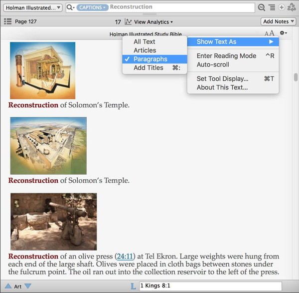
In addition to customizing the kinds of content you see, you can also adjust the amount of content you see. In Bible tabs, you can drag the context slider to change the amount of context you see. In Tool tabs, you can go to the Gear menu and choose how much content you want to see from the Show Text As submenu. For example, let’s say I want to search a resource for illustrations I can use in a slide presentation. By searching the Captions field of the The Holman Illustrated Study Bible and choosing Paragraphs from the Show Text As submenu, I turn the study Bible into an image catalog!
That’s what I mean by thinking outside of the book. Rather than being bound by the way a given book presents information, Accordance lets you tailor that information according to your current needs.
14. We Don’t Compartmentalize. Many Bible programs fall into the trap of compartmentalizing various kinds of Bible study tasks. Thus, each Bible study task—reading the Bible, examining the results of a search, comparing translations, viewing an interlinear, and so on—tends to be treated as a separate task which takes place in its own window with its own distinct interface. If you’re like me, Bible study is typically a much more organic and free-flowing process. I may start to read, find something I want to search, become curious about how other translations handle that aspect of the text, look up the Greek or Hebrew behind it, consult a commentary, etc. If I had to open a separate window with a distinct interface for each of these tasks, Bible study would become painfully laborious. But in Accordance, I can do all of these things within the Search tab as the occasion demands: open a pane, check a box, drag a slider, enter a search, or whatever. By not compartmentalizing Bible study tasks, Accordance offers a flexible interface that is ready for anything.
15. We Don’t Play Hide and Seek. Up to now, the design principles we’ve covered have been “more what you’d call ‘guidelines’ than actual rules” (to quote Captain Barbosa from Pirates of the Caribbean). This one feels more like a rule. Our development team is absolutely committed to avoiding an interface which plays hide-and-seek with the user.
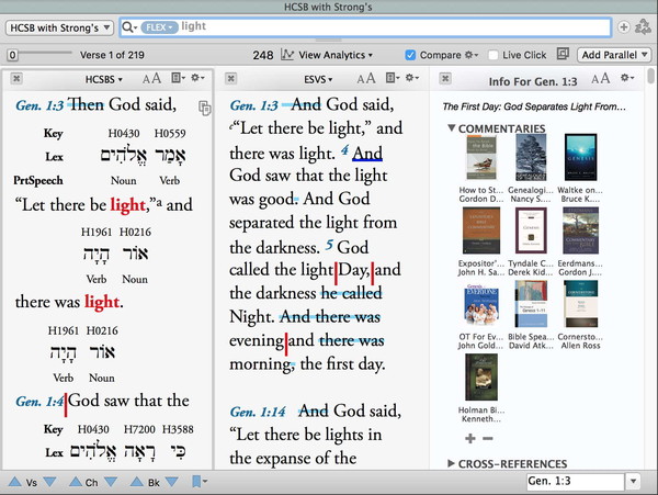
For example, when you enter a search in the top part of a search tab, you get your search results down below, but the search argument itself stays visible. Why? Because we never want you to be confused about how you got your search results. What’s more, we always try to give you visual feedback so you know exactly what’s going on. For example, when you enter your search argument, the text appears black, but once you hit return, it changes to gray to indicate that the search has been run. It may seem like a little thing, but I have actually had times when I have created a complex search, and before I could hit Return to run the search, my little boy came in and distracted me. When I finished with him, I looked at my search results and was confused, because they didn’t match what I expected. It was only when I looked at the text color of my search argument that I realized I simply hadn’t run my newest search.
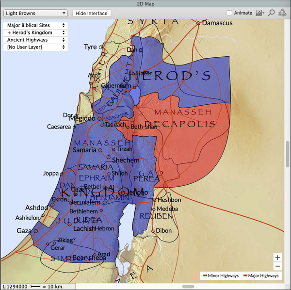
Here’s another example. In the Atlas window, you can select more than one map layer from one of the pop-up menus by holding down the Shift key while selecting the second layer. In this example, I’ve combined two region layers: Herod’s Kingdom and Tribe Borders. But since the pop-up menu can only show one layer at a time, we add a plus beside the name so you will know there are additional layers. You can then open the pop-up menu to see all the currently selected layers, which are marked by a plus sign.
I could give you countless other examples, but you get the idea. We never want what you view to be affected by some hidden criteria or selection which you can’t immediately see has been selected. So we always offer some sort of visual feedback.
16. “Easy is Hard”. I stole my title for this design principle from The Macintosh Bible, an old book about Macintosh computers which included this bit of wisdom:
There’s a macho attitude among some computer jocks … that the harder something is to deal with, the more advanced it is. Actually, of course, it’s very hard to make things easy. The more work you put into something, the less work the person who uses it has to do. So if you find yourself beating your head against a wall erected by someone’s laziness (or greed), look around for a different wall that someone else took the trouble to put a door in. And if anybody mocks what you’re using as a toy, just smile and say, “Easy is hard. Hard is primitive.”
That actually sums up our approach to software design quite nicely. It’s hard to make something easy, which is why many software developers never bother to try. It takes effort to program Accordance to recognize just about any Bible book abbreviation you happen to enter. It required work to let you enter Greek and Hebrew grammatical tags using real words in any order you want rather than forcing you to learn cryptic codes which must be placed in a specific order. It requires work to continually streamline and refine the Accordance interface to make it increasingly easy to use.
Easy is indeed hard. But when you create a product that makes studying the Bible easy for many thousands of people, all that effort is well worth it.
That’s 5 aspects of our design philosophy which have enabled Accordance to keep going strong after 25 years. In my next post, we’ll look at reasons related to some key business decisions we’ve made along the way.


